Using R’s ggplot2 to recreate a hand-drawn W.E.B. Du Bois data visualization

racism sociology dataviz ggplot2

fine-tuning margins, lables, and annotations

Jeremy Allen https://jeremydata.com
02-21-2021
original and recreation

Figure 1: original and recreation

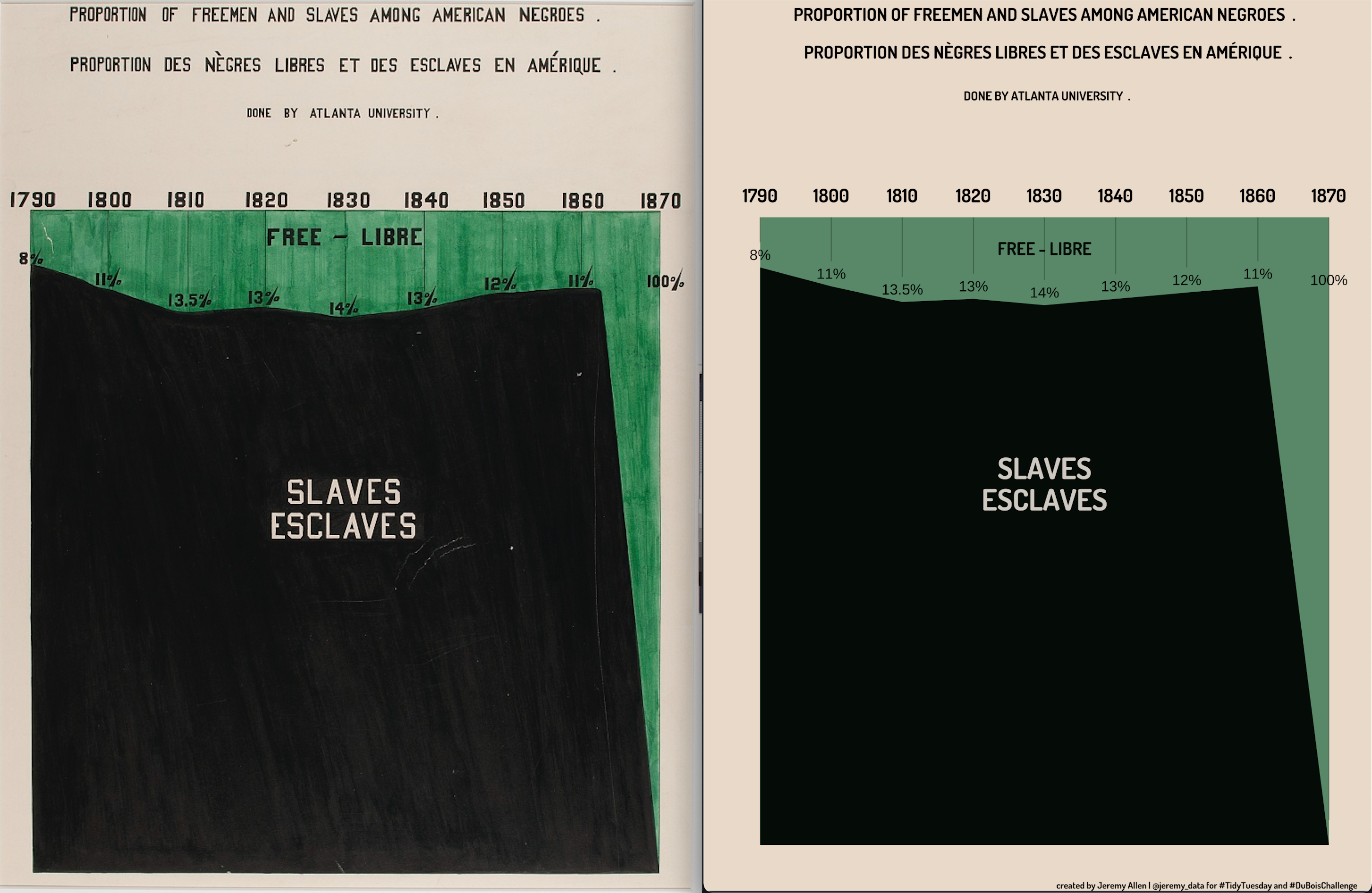
For the 1900 Paris Exposition, sociologists W.E.B Du Bois curated a set of photographs and created hand-drawn data visualizations to combat racism in science and culture. In February 2021 #TidyTuesday and the #DuBoisChallenge collaborated to challenge us to use modern tools to recreate Du Bois’s data visualizations.

I chose to recreate plate 51. I learned a ton about spacing in R’s ggplot2 package. How to implement margins around any element, how to add empty lines in title and subtitles, how to use if statements to conditionally place data labels and more. All the code is on my Github.

Please visit two places to read and see more about W.E.B Du Bois’s work for the 1900 Paris Exposition. The Library of Congress site for all of the materials. Anthony Starks’s recreations of all the pieces.

Reuse

Text and figures are licensed under Creative Commons Attribution CC BY 4.0. The figures that have been reused from other sources don't fall under this license and can be recognized by a note in their caption: "Figure from ...".

Citation

For attribution, please cite this work as

Allen (2021, Feb. 21). jeremydata: Using R's ggplot2 to recreate a hand-drawn W.E.B. Du Bois data visualization. Retrieved from https://jeremydata.com/posts/2021-02-21-using-rs-ggplot2-to-recreate-a-hand-drawn-web-du-bois-data-visualization/

BibTeX citation

@misc{allen2021using,
  author = {Allen, Jeremy},
  title = {jeremydata: Using R's ggplot2 to recreate a hand-drawn W.E.B. Du Bois data visualization},
  url = {https://jeremydata.com/posts/2021-02-21-using-rs-ggplot2-to-recreate-a-hand-drawn-web-du-bois-data-visualization/},
  year = {2021}
}