An R Shiny app designed for my family to track a single metric and to promote data literacy by including explanatory text with the data visualizations.
Figure 1: Top distinguishing words in men’s and women’s Christian-Living book descriptions
I made this R Shiny app for my family to track a single metric. To promote data literacy, I included explanatory text with the data visualizations. CSS flexbox controls the layout, so the app works on mobile devices well.
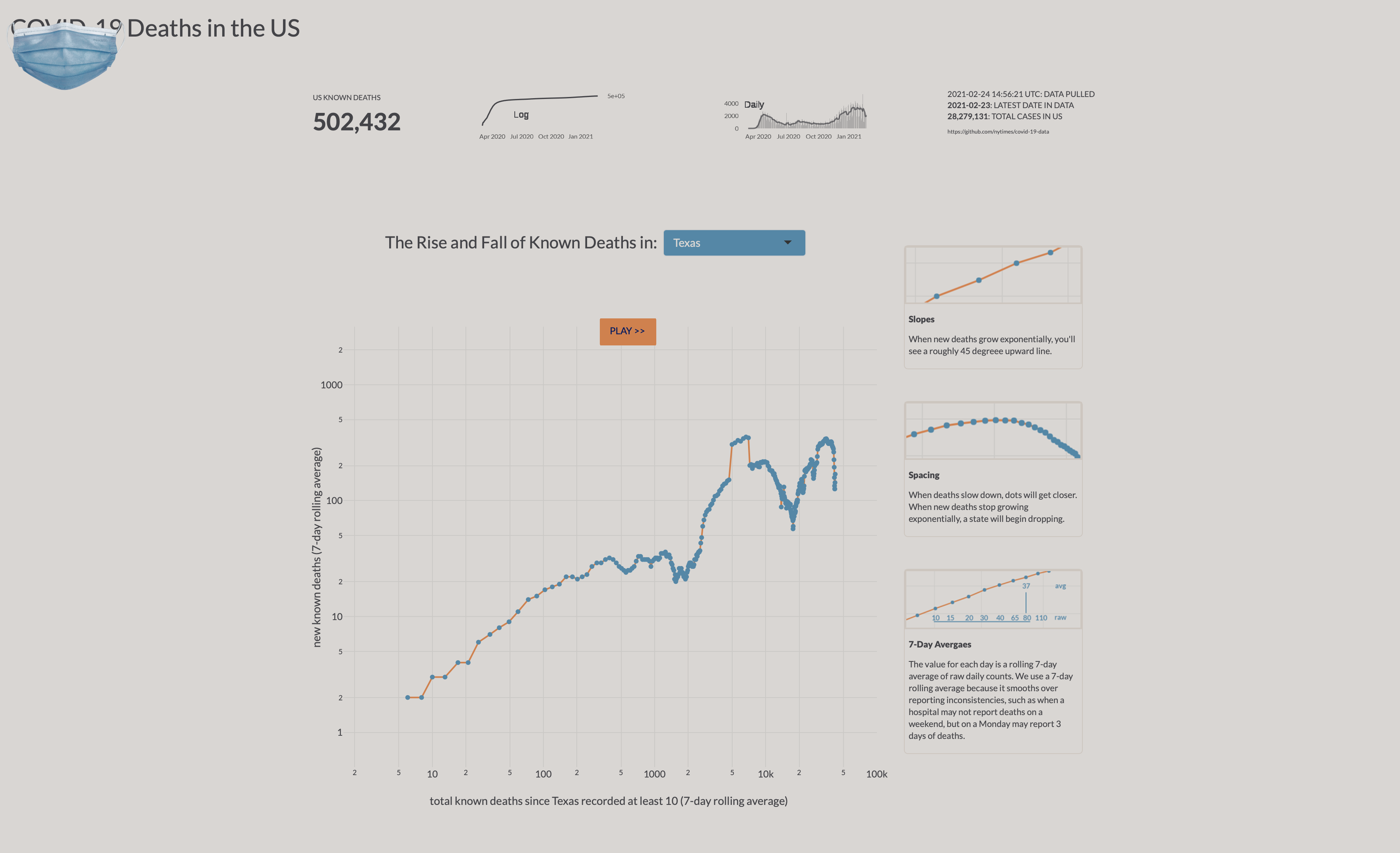
The main visualization is an animated chart I created with the plotly package for R. Plotly for R enables interactive javascript-based visuals. I chose this for the main data visual in order to make obvious when the coronavirus is spreading exponentially and when it is not.
The image above is just a screenshot. Go check out the app at https://jeremyallen.shinyapps.io/covid_deaths/.
Text and figures are licensed under Creative Commons Attribution CC BY 4.0. The figures that have been reused from other sources don't fall under this license and can be recognized by a note in their caption: "Figure from ...".
For attribution, please cite this work as
Allen (2021, Feb. 24). jeremydata: COVID-19 Death Tracking App. Retrieved from https://jeremydata.com/posts/2021-02-24-covid-19-death-tracking-app/
BibTeX citation
@misc{allen2021covid-19, author = {Allen, Jeremy}, title = {jeremydata: COVID-19 Death Tracking App}, url = {https://jeremydata.com/posts/2021-02-24-covid-19-death-tracking-app/}, year = {2021} }